UX Case Study — An Online Coding Bootcamp Website Redesign


Disclaimer
This redesign was part of the Compfest 14 UI/UX Committee recruitment challenge. I was not in any way paid or assigned by company/organization/personal to redesign their website. Although this process was real and involved real person in research, this project was purely fictional and was not implemented.
Summary
Project Name
Online Coding Bootcamp Website Redesign
Role
UI/UX Designer
Project Date
16th — 19th March 2022 (4 Days)
Project Background
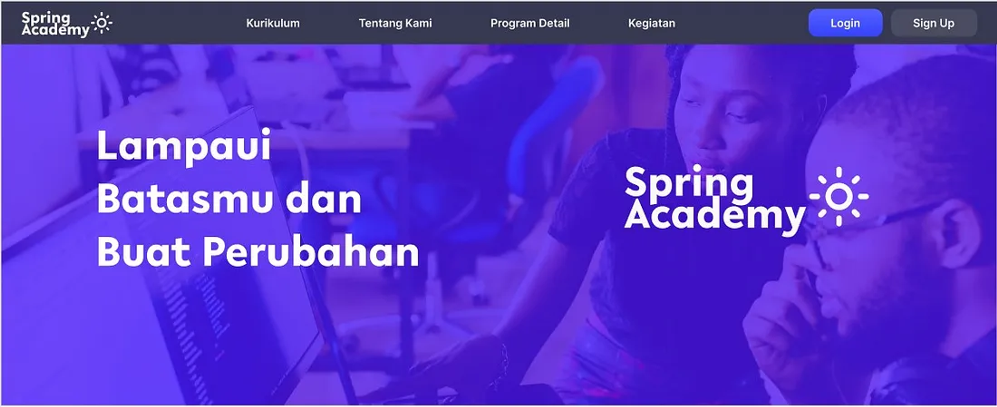
Spring Academy is a fictional coding bootcamp platform which provides high quality coding training for free for students and people of Indonesia. In this project, I worked as a UI/UX Designer tasked to find and redesign problems found on the website in order to improve the user’s, in this case students, experience when exploring the Academy’s program, signing up for the program, and progressing in the Spring Academy program.
Challenges
- How can I analyze and locate the website’s pain points for the user?
- How can I create a more friendly and cleaner process for signing up and ?
Design Process
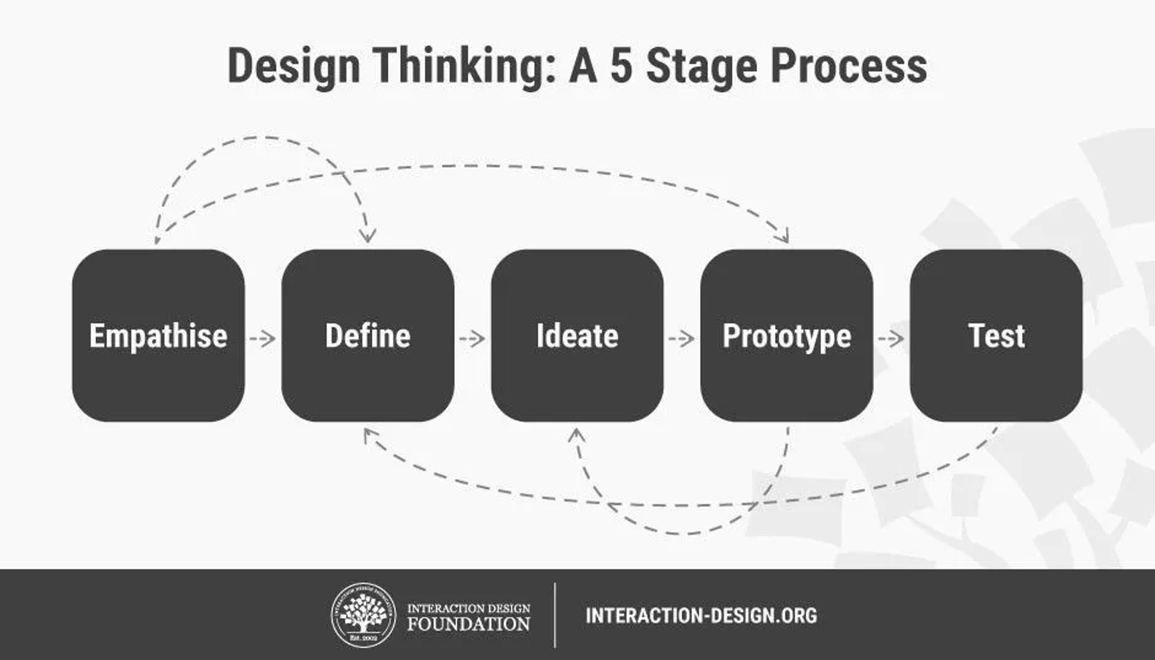
Before starting, I researched several methods of design framework in order to lay down a solid foundation for this project. I ended up choosing the Design Thinking process since that framework is the most familiar design framework for me. This framework helped guide my workflow and produced a user-centered solution.
Design Thinking Framework consists of five stage processes, which are Empathize, Define, Ideate, Prototype, and Testing.
Step One : Empathise
UI/UX Design is about solving a problem using design in order to create a better experience, so to do it, I need to first find the problem within the old website. I started with figuring out some of the problems myself, but doing it alone would be unreliable since several problems could be missed and there could also be biases.
Therefore, I conducted a research in order to gather as much data as possible before starting the redesign so a clear problem could be determined. The research that I conducted was aimed towards students, the main audience of this website, and done with the goal of finding out:
- How do the users join a coding bootcamp program?
- In which step of the process does the user feel confused or frustrated?
I chose these goals to find out how the users behave and interact with the website’s main features and goals and to determine the pain points while doing it.
Research Goal
The goal was to identify the problems the user had when trying to join and work on the bootcamp. This process started from user account registration up to the user dashboard.
User Profile
The target audiences were currently enrolled bachelor degree students.
User Task
- Create an account on the website.
- Accessing user account dashboard.
Interview Questions
- How was the registration process?
- Are there any point in which you felt frustrated or confused, and if so, in which part and why?
- Are there any parts of the website that you like or that you hope could be improved?
Step Two : Define the Problems
After conducting the usability test, it was time for me to analyze the data provided from the research in order to create the needed solution.
Gathering and Sorting Data
The first step of analyzing the data is to arrange and group the data to help ease the reading and processing later on. I did three interviews with three different subjects, and here I gathered their insights and feedbacks into sticky notes in Miro. After gathering them, I sorted and grouped them into their respective section. This way I can see clearly the problems in each part of the website.
Step Three : Ideate the Solution
After grouping the data and assigning them to our respective tasks, we continue to separate it and analyze the problem from the data, which is the user’s voice. We determine the problem, and then create How Might We which then we turn into solutions. The key How Might We from the data that could helped my tasks are:
- Create an interface design that is easy to understand and allow the users to explore the programs of the bootcamp
- Give useful information about the bootcamp program.
- Create a streamlined registration flow.
Creating a New User Flow
Now that I found the solution, I then created an improved user flow. Some examples of improvements was that I combined the first and second page of the booking process so when there were no matching time for the user, they don’t have to go back a page to change it.
Step Four : Prototyping
Now that the solution has been found, it was time to visualize it.
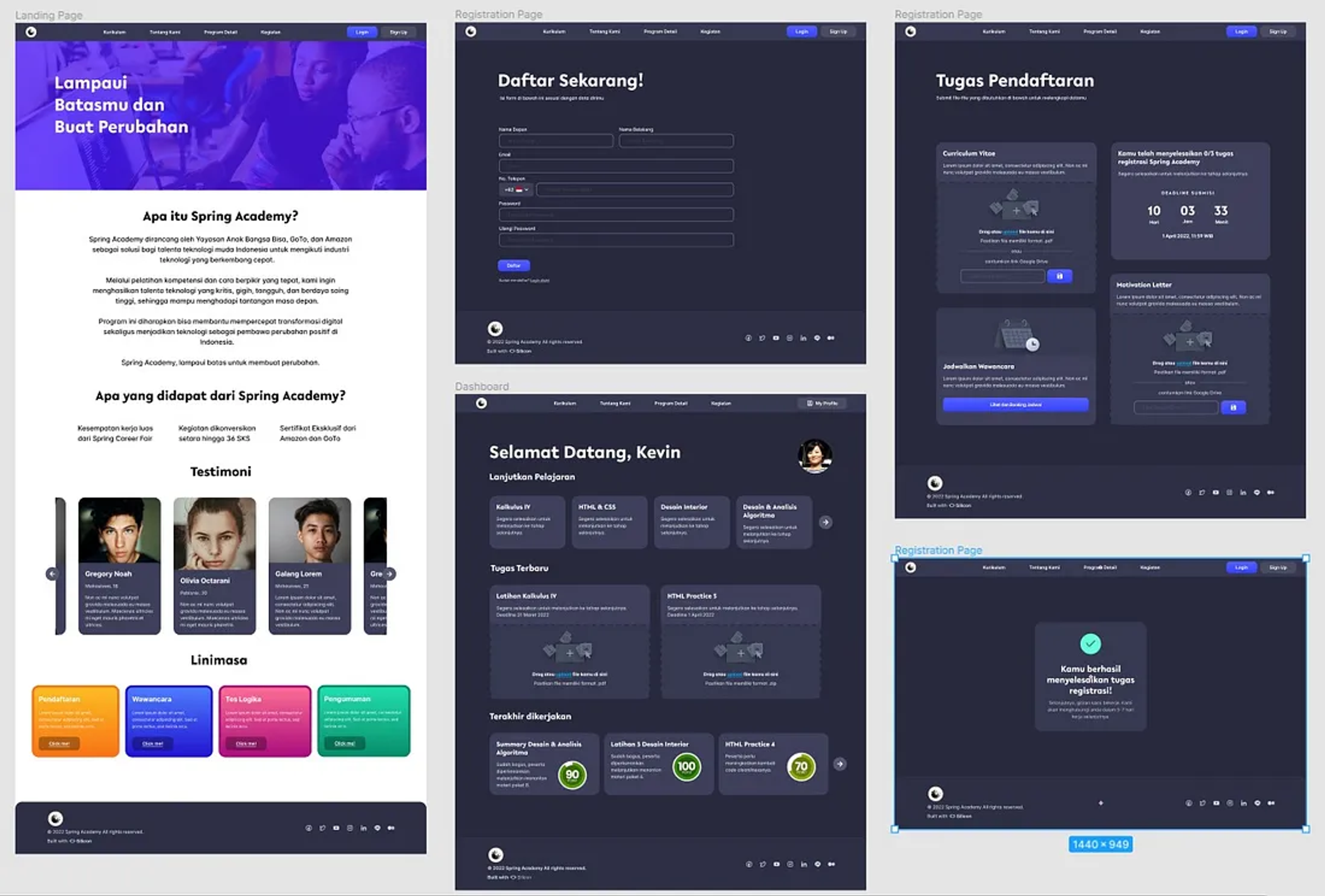
High-Fidelity Design
After deciding that I will be designing the landing page, registration page, and user dashboard, I continued the process with creating the high fidelity prototype and wireframing for the store due to time constraints. I tried to keep in mind the result of the research and tried to create the interface of the website as simple as possible and using many Silicon Design System element to ensure design consistency.
I started working on the high-fidelity prototype using Figma. I tried creating as close as the hoped finished implementation would look like. I matched the looks of the machine with Silicon Design System theme, and did several explorations of the visuals.
Step Five : User Testing
Creating solution without checking if the solution works is bad practice, therefore my team and I planned a usability test on the working prototype.
Usability Test
Usability Test is a research method where the user will be ask to complete certain task using the prototype while the interviewer will observe their behavior. I interviewed 3 people who have different experiences of learning in online bootcamp to diversify the result and obtain as much data as possible. Because of the pandemic, I had to do the research online using voice and video communication software such as Discord and Google Meet.
The Result
After conducting the usability test, I found out that the current solution is already good because all of the users are able to navigate through it. At this point, I am approaching my deadline really fast and I don’t have anymore time to research or redesign.
Conclusion
This was an amazing journey and experience as I am still exercising and developing my UI/UX design knowledge to practice. This was far from perfect and there’s a lot of improvement that can be made. After having some more experience, and looking back at this project, there were several things I listed which can be improved:
- The questions and methods I used during the usability test can be improved such as using open-ended questions and giving several use scenarios, including edge-cases
- Grouping and analyzing the data can be neater, and other methods such as competitor analysis and user persona can be combined given enough time.
- Information Architecture can be used to analyze the website structure as a whole
- There are different, easy, and effective programs that can be used to create wireframes, such as Whimsical, which can bring even more clarity to the interaction and layout requirements.
- The prototype can be much better with different flow.
- The validation test is crucial and shouldn’t be skipped as it is essential to validate the design and reiterate if there is a new issue.
- User form when registering can be separated into several steps (progressive disclosure)
I hope I can learn something and improve from this wonderful experience. I also would like to express my gratitude to Stefanus Ndaru Wedhatama for giving me insights on how to create a case study and Muhammad Hannan Massimo Madjid & Luthmilla Sari Bhaskara for reviewing the UI/UX side. Cheers!

